From Boarding to Business
The goal of the Travel Service rebrand was to create a visual identity that feels smart, modern, and constantly in motion—mirroring the nature of travel itself.
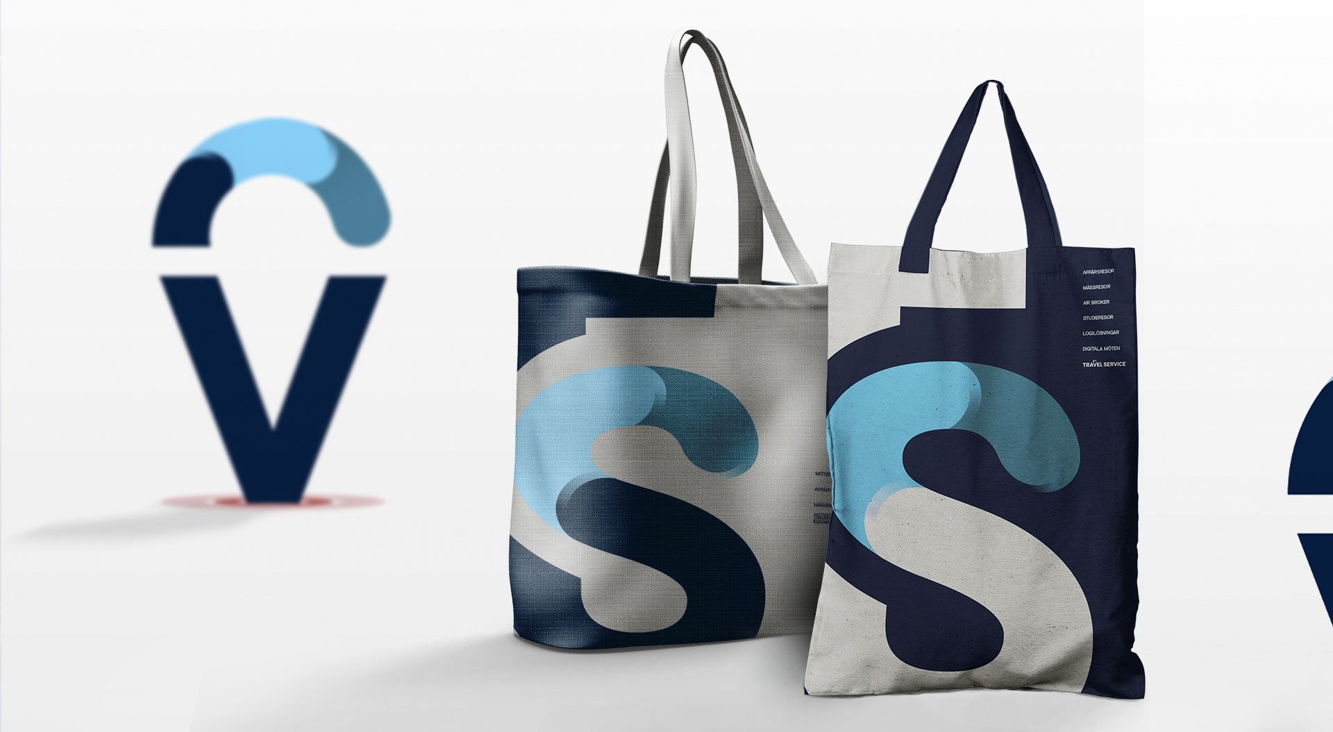
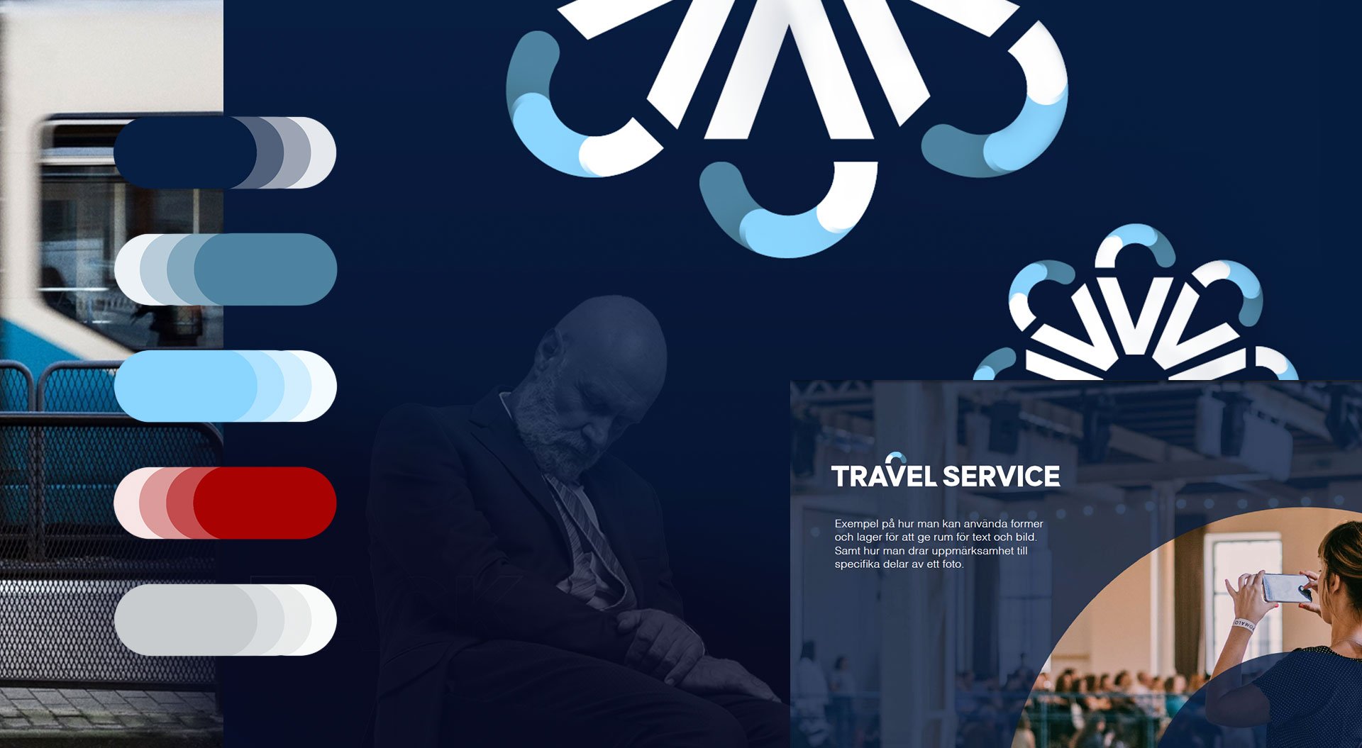
The new logo centers around a custom “V” shaped like a location pin, symbolizing precision and destination. Surrounding it, segmented circular shapes represent the brand’s ability to offer customized packaging solutions, tailored to each client's journey. Together, these elements create a sense of movement, direction, and flexibility.
A clean, professional color palette anchored in navy with gradient blues and energizing reds helps the brand stand out in the travel sector while maintaining trust and clarity. Supporting visual elements emphasize flow and structure, creating a system that adapts effortlessly across platforms.
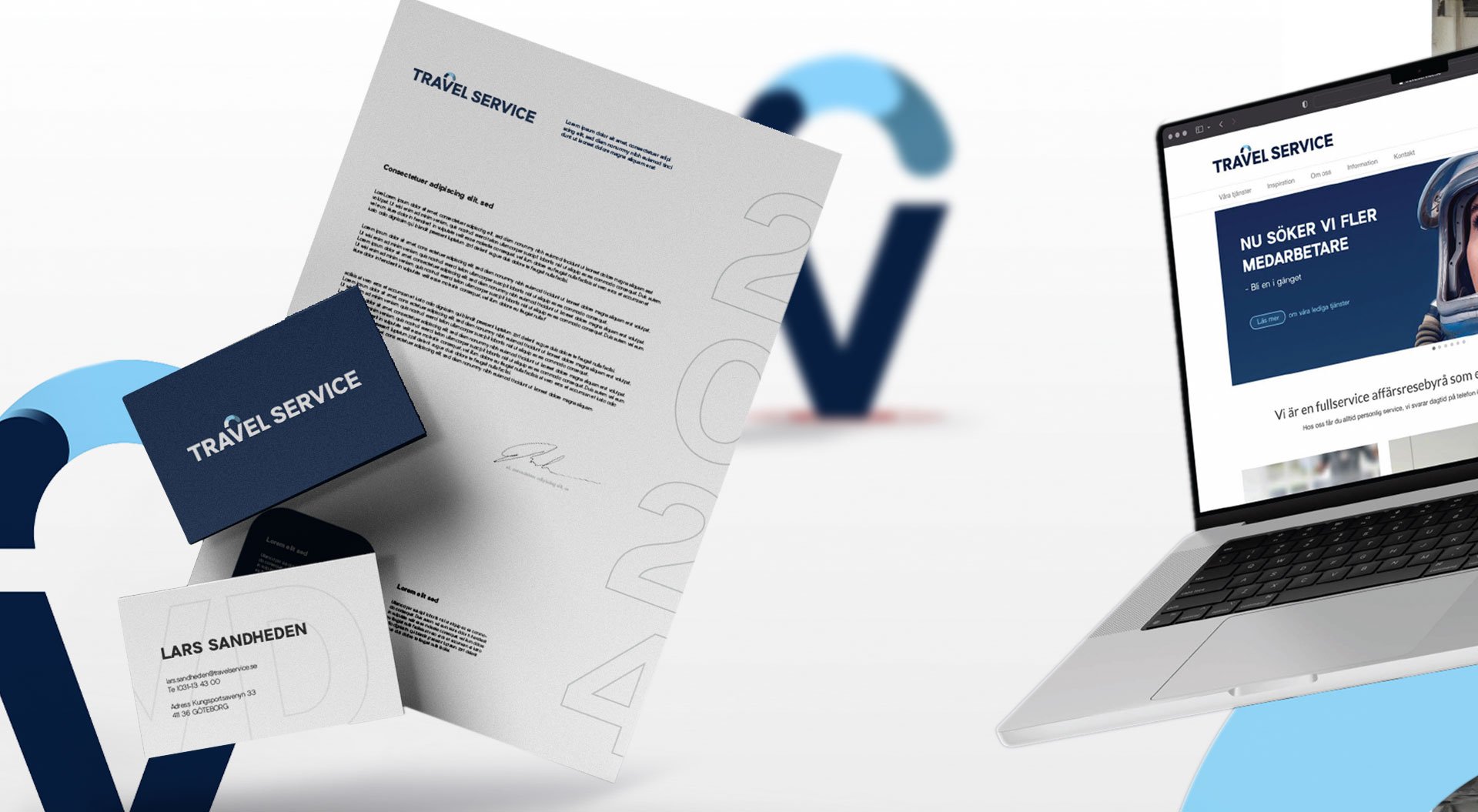
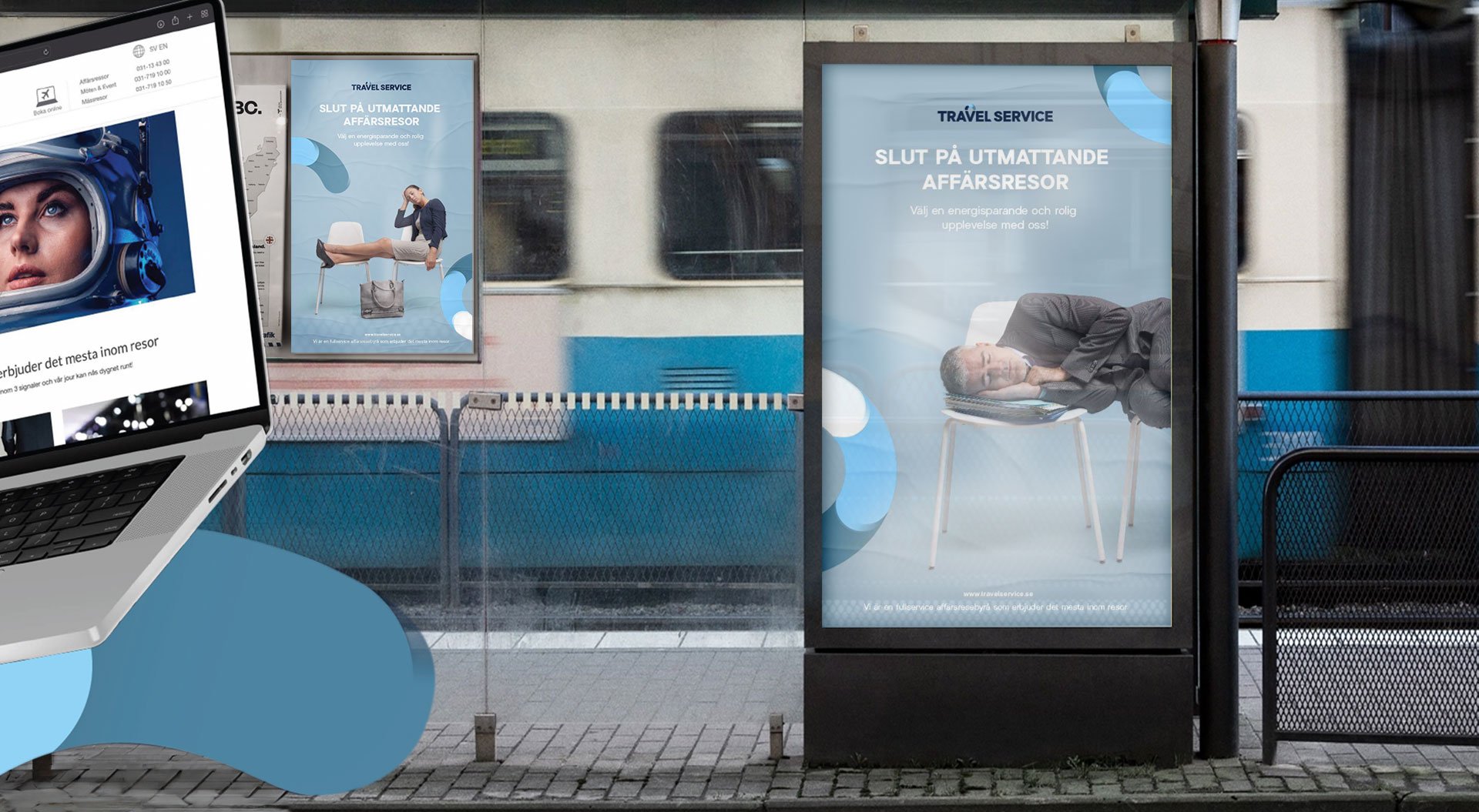
The brand guidelines were built to ensure consistency and scalability, whether the identity appears on digital screens, printed collateral, or large-scale out-of-home formats, always conveying a brand that’s organized, adaptable, and always moving forward.
Travel Service
About the Brand
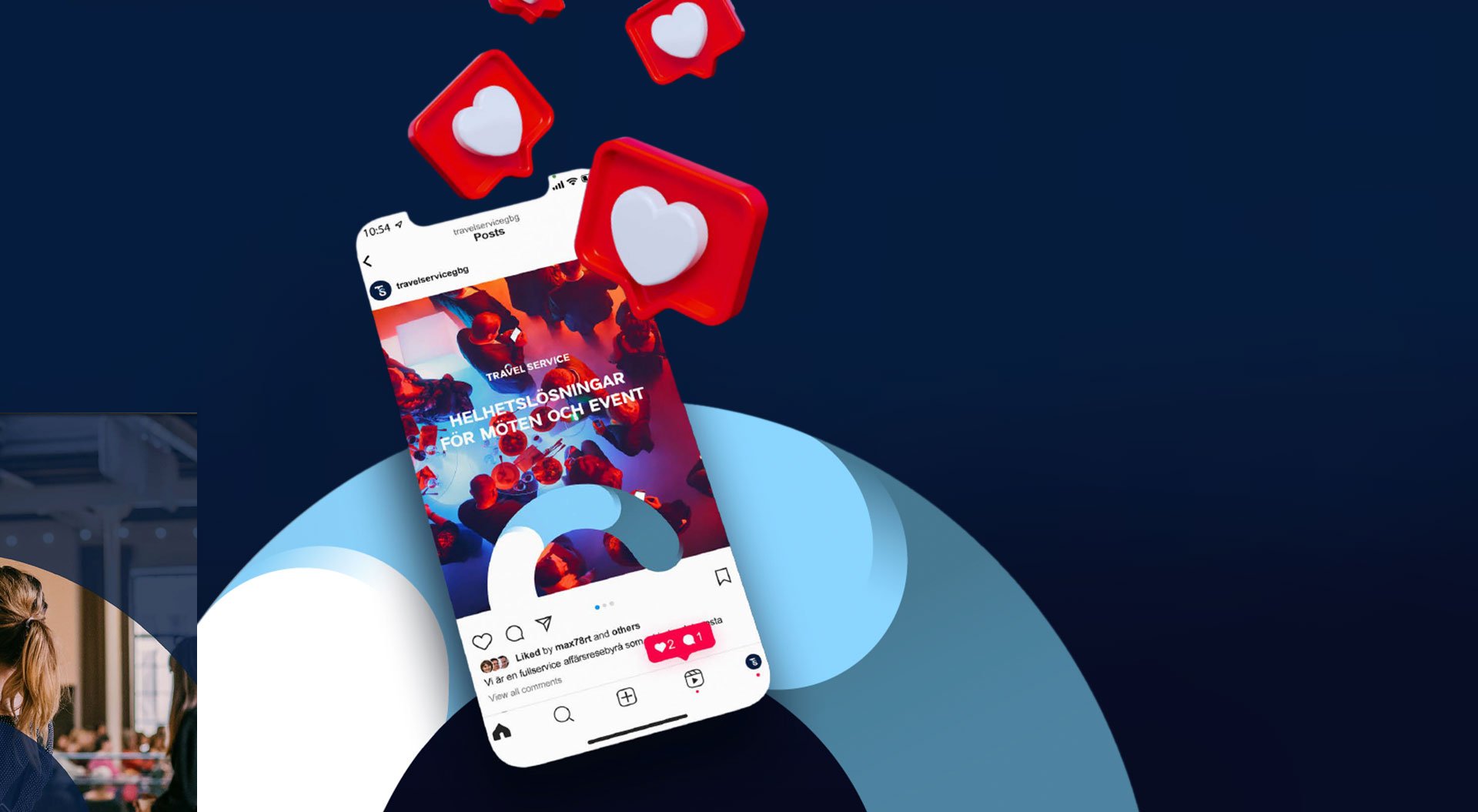
Travel Service is a modern travel and logistics company focused on making business travel smarter, smoother, and more sustainable. Their services are designed to help professionals and organizations book, manage, and optimize corporate travel with ease, offering streamlined support, transparency, and tailored experiences from departure to return.
With a user-first approach and a growing digital ecosystem, Travelservice positions itself at the intersection of tech-driven solutions and human-centered service.
Project
Logo Design
Brand Identity
Print
Digital/Social
Freelance
Art Direction
Graphic Design